Introduction
The Dropdown component is a versatile tool in the GoodBarber design system. It can be used in a variety of contexts, such as in forms for user input, or in navigation menus for making selections. The component is highly customizable, providing a user-friendly and visually appealing way to present and select options.
Anatomy
Common design principles
Like Textfield, the Dropdown component comes in 3 sizes (Small, Medium, Large) and 2 types (Title UP and Title IN), however, some design principles are common to all these variations :
| Title UP | Title IN |
|---|---|
| ↓ | ↓ |
Inactive state
Focus state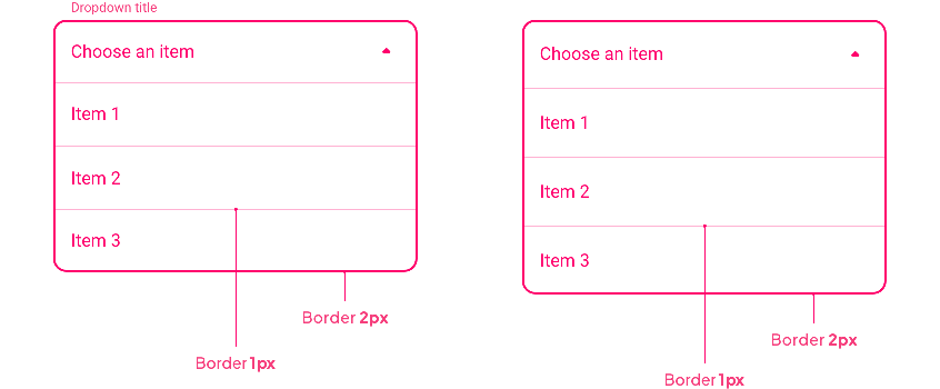
Complete state
Component height
All field heights in a row are described in the Text Field section ( Title UP Title IN). The Dropdown component uses these field heights for the state Disabled / Inactive / Complete / Error.
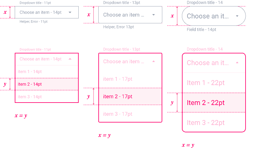
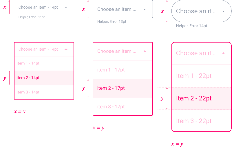
For the Focus and Focuserror states, the height of the base field is used for the list items:
Title UP
Title IN
Font Size
The Font size changes depending on the devices and the choice of the component size. You can have an overview of all used sizes at the bottom of the Text Field section.
| Component Size | Text Level | Mobile | Tablet | Web | ||||||
|---|---|---|---|---|---|---|---|---|---|---|
| Small | Body 1 | 14 | 15 | 16 | ||||||
| Small Body 1 | 11 | 12 | 12 | |||||||
| Medium | Body 1 | 16 | 17 | 19 | ||||||
| Small Body 1 | 12 | 13 | 13 | |||||||
| Large | Body 1 | 19 | 21 | 22 | ||||||
| Small Body 1 | 13 | 14 | 14 |
Properties
Shape
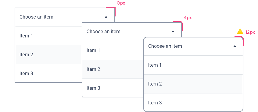
Below, the Shape atom applied with the types Sharp / Rounded / Round for the states Disabled, Inactive, Complete and Error:

For Focus and Focus Error states in Round, we go from a radius of 50% of the component height to 12px.
Border
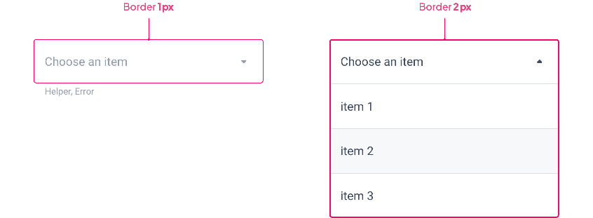
By default, the Border Atom value is 1px for all states except Focus.
| Disabled / Inactive / Complete / Error | Focus / Focus Error |
|---|---|
| ↓ | ↓ |
Shadow
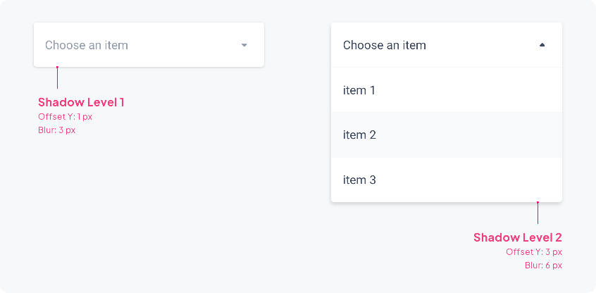
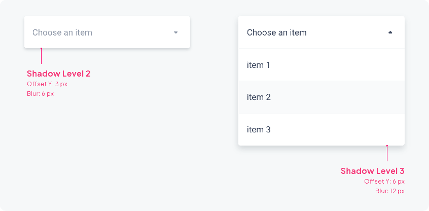
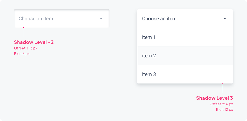
The Shadow level changes for the Focus and Focus Errorstates: in fact, we go to the higher level to accentuate the elevation and thus highlight the activated component.
⚠️ Please note that the Inner Shadow option is not available for Focus and Focus Error.
| Disabled / Inactive / Complete / Error | Focus / Focus Error |
|---|---|
| ↓ | ↓ |

Layout
Overlapping
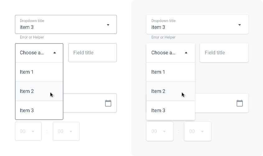
As we’ve just seen, the Border and Shadow properties change with the Focus state. This allows the active component to be highlighted, especially when the elements overlap as below:
| Border | Shadow |
|---|---|
| ↓ | ↓ |
Overflow
When the text of the component is larger than the allocated space, ellipses are used.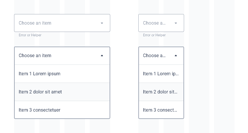
Behavior
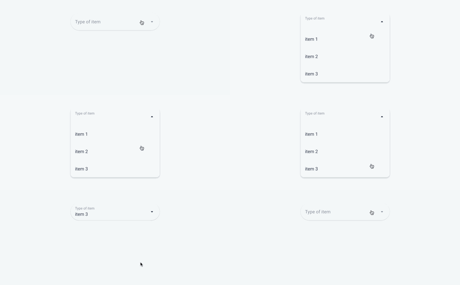
States (Complete path)
| Title UP | Title IN |
|---|---|
| ↓ | ↓ |
Disabled
Inactive
Focus
Hover
Complete
Error
Error Focus
States (Pre-selection)
| Title UP | Title IN |
|---|---|
| ↓ | ↓ |
Inactive
Focus
Complete
 Design