 eCommerce
 Sistemi di abbonamento
 RAG Chatbot
 Corsi online
 Prenotazione online
 Guida turistica
 Eventi
 Creatori di contenuti
 Consegna locale e Ritiro in negozio
 Giornale
 Radio
Radio Scuole e università
 Fede
Fede Organizzazioni
 Ristorante
 Alimentari
 Costruisci l'app su misura
 Comunicazione con i dipendenti
 APP BUILDER SENZA CODICE
 TECNOLOGIA
 PERCHÉ GOODBARBER?
 Design
 RISORSE DEL PRODOTTO
 TEMI
TEMI
 RIVENDITORI DI APP
 SCOPRI
Introduction
This section of the design system is dedicated to the concept of aspect ratio and how it affects the appearance of images in the app. The aspect ratio of an image is an important factor to consider when designing an app, as it has a significant impact on the overall look and feel of the interface. The aspect ratio is the ratio of width to height of an image and it determines the proportions of the image.
This ratio has a strong influence on the appearance of a page and the user will be able to define it for certain types of images.
In this section, we categorize the different types of images to understand their influence on the layout.
Mostly used aspect ratio
Overview
In “views”, the most commonly used ratios are: 2.75:1 16:9 1.618:1 4:3 1:1, the 4:1 format is reserved for the Logos.

Thumbnails aspect ratio
The user has control over the choice of the thumbnail format (examples : images in a list, widgets, headlines etc.). He can choose between: 16:9 4:3 1:1

Relative aspect ratio
In this case, the aspect ratio of an image may depend on the device on which it is displayed, or on another image or its environment.


Original aspect ratio
Here, we keep the original width-height ratio of an imported image.
This concerns images in certain lists, such as photo templates, but also images in the body of articles (detail), images in the submit section etc.
This feature allows the display of a photo taken in portrait mode in particular.

Categories & Uses
Headers & Headlines
The Headers are at the top of the Detail sections, the Headlines are the images highlighted in the Sections and List type Widgets.
Most common configuration
- Mobile, Tablet portrait: 1.618:1 (Golden ratio)
- Tablet landscape: Relative (= to image height in Tablet-portrait mode)
- Laptop, Desktop: 2.75:1

Variations
In this first variation, only the Mobile ratio changes and becomes square.
Widget Event List Une Classic, Section Event Detail, Section Article List Visuel for example.
In the variant below, we have the same organization as above but the layout is slightly different to create the carousel.
We find this in the Widget Navigation Banner Small Carrousel.
This last variation concerns Headlines. In Web, the image no longer occupies the totality of the width: the Headline (image + text) takes 2 columns.
The version with margins works slightly differently: the Headline comes to match the width of the content in Mobile and Tablet.
Example : Widget et Section Article List ClassicUne.
Thumbnails
Thumbnails are the preview images present in the vast majority of lists. Their size will be affected by the choice set by the user, but some templates will escape this rule.
Users selected ratios
In some templates, the user will be able to choose among these 3 predefined ratios for the size of the preview thumbnails 16:9 4:3 1:1
Examples : Widget Article List Une Classic, List Classic, Banner Classic...
“System” ratios
Here we are talking about thumbnail sizes that are not influenced by the user's choice as some templates do not allow this.
Square thumbnails → The ratio used is 1:1 on all devices.
Examples : Section Article List Checkerboard, Section Photo List Square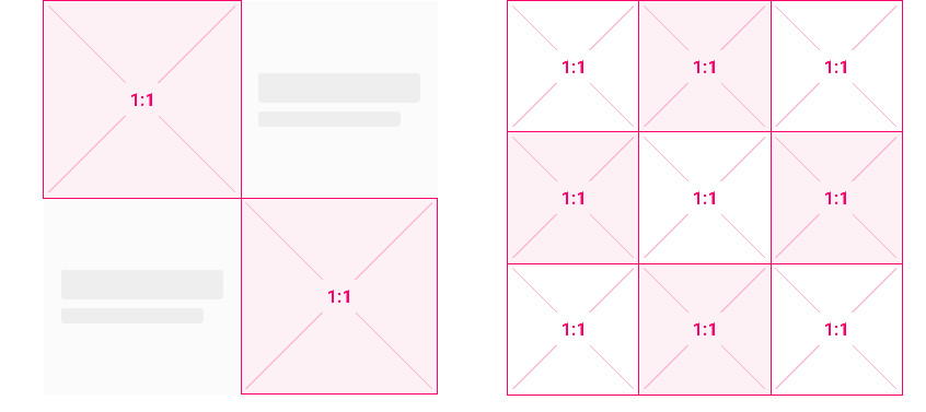
Checkerboard thumbnails ratio Split thumbnails → In this case, the base of the thumbnail is square and we split at the 3rd third.
Example: Event List Split section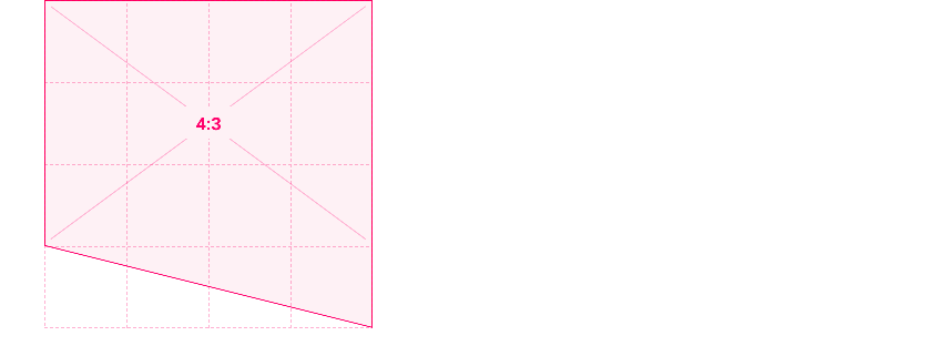
Split thumbnails ratio 3:4 thumbnails → In some grid type templates, we cheat a little by reversing the 4:3 ratio.
Examples: Widgets Navigation List Grid, Section Multilevel Grid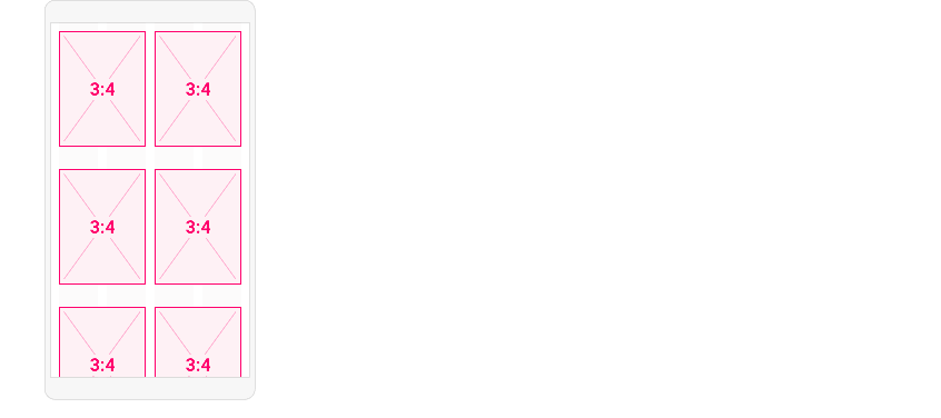
Grid thumbnails ratio Relative size thumbnails → Many sections and Highlight widgets are affected. In the example below the size of the thumbnail is relative to the size of the Headline , but only for Tablet and Web. Indeed, in Mobile the cascade layout allows to use the size chosen by the user
Examples: Widget Article Highlight Une Grid, Section Multilevel Une Grid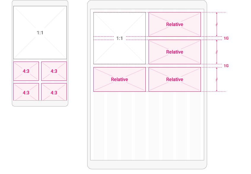
Relative ratio thumbnails In this other case, the height will be relative to the ratio chosen by the user.
Examples : Widgets Navigation ListVisual, Sections Multilevel Visuels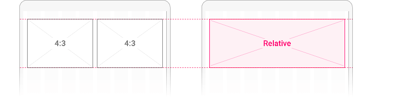
Other example of relative ratio thumbnails


Please see the Thumbnail component section for more information about this component.
Original size images
We are talking about imported images that will not be cropped.
An image imported into a Section Detail feed will keep its original ratio. This is also the case for images imported from the Submit or Twitter sections.
Sections Details & the full width option
In the thread of a detail section the user has the possibility to display their image in full width, the image will not be aligned on the content and it will take the whole width of the page:

Section Photo Detail
In this template, we want the image to occupy a maximum of the visible area on each screen while maintaining the original ratio of the photo.
- In Mobile and Tablet portrait, we use the full width of the screen.
- On other media, we will rely on a safe area to contain the image in the visible area.

Videos
A video will be viewed at its original size in the Video Detail section:
Full page image
The image occupies the entire space and its size will therefore necessarily be relative to the devices .
Examples : Widget Article Banner Minimal, Section Multilevel SlideShow...
Specific components
Avatars and logos are images, but also components in their own right.
Avatars
Whatever the style assigned to an avatar (square, rounded or round) its base will be square
Logos
The ratios used for these elements will be 1:1 or 4:1.